
Financial and demographic relevant to the unit are collected.
Collecting demographic data2
Collection of demographic data can be broadly categorised into two methods:
- Direct
- Indirect
Direct demographic data collection is the process of collecting data straight from statistics registries which are responsible for tracking all birth and death records and also records pertaining to marital status and migration.
Perhaps the most common and popular methods of direct collection of demographic data is the census. The census is commonly performed by a government agency and the methodology used is the individual or household enumeration.
The interval between two census surveys may vary depending on the government conducting. In some countries, a census survey is conducted once a year or once every two years and still others take a census once every 10 years. Once all the data collected are in place, information can be derived from individuals and households.
The indirect method of demographic data collection may involve only certain people or informants in trying to get data for the entire population. For instance, one of the indirect demographic data methods is the sister method. In this method, a researcher only asks all the women about the number of their sisters who have died or have had children who have died and at what age they died.
From the collected data, the researchers will draw their analysis and conclusions based on indirect estimates on birth and death rates and then apply some mathematical formula so they can estimate trends representing the whole population. Other indirect methods of demographic data collection may be to collect existing data from various organisations that have done a research survey and collate these data sources in order to determine trends and patterns.
Methods for recording data
Once the researcher has collected all the relevant figures, s/he has to sort them into a reasonably compact statement.
Both the final report, as well as the intermediate stages will consist largely of statistical tables, as they are a convenient way of summarising the data in an orderly manner and of presenting the results concisely and intelligibly. To record data, you could use:
Worksheets are generally kept as a permanent record of the calculations performed on the data, both as a guide for future investigations and for reference in case figures are queried or further detail is required
The great advantage of charts is that the important features stand out immediately, for example comparisons and trends, which would normally only be revealed by careful checking of figures.
It is important to remember that charts must not depict too many items and the colours must also be clearly distinguishable, as confusion could arise.
Most of the charts occurring in statistics are graphs or similar to graphs in that they represent relations between two variables, for example we have time-series charts, which show how one variable, such as output, sales, population or prices, varies with time.
The most common types of charts are:
- Pie charts
- Line graphs
- Bar charts
- Stack bar charts
- Histograms
We will discuss them in more detail in Module 6.
Methods for organising data
Data that have been collected are not very useful in their raw form. They have to be processed or worked with so that we may draw helpful conclusions from them. This means the data must be organised or arranged in a way that makes sense, e.g.:
A very simple way of organising data is to arrange them in ascending order; that is, write all the numbers down arranged in order from smallest to largest
Another important aspect of organising data is to work out or calculate various features of the sets of data you have obtained.
This means working out the averages of the data (we use the mean, median and mode). These averages are called “measures of central tendency”, and they give us an indication of how close the data points are to one another.
Another important feature of data is something called “measures of dispersion”. This tells us how the data points are spread, how far apart they are from each other, or how scattered they are. Here we calculate the range, the standard deviation and the variance.
Methods for analysing data
Data collected should be organised before it can be compared. This makes it easy to use and make meaningful analysis.
When analysing data (whether from questionnaires, interviews, focus groups, etc.), always start by reviewing your research goals, i.e. the reason you undertook the research in the first place. This will help you organise your data and focus your analysis.
Example:
If you wanted to improve a program by identifying its strengths and weaknesses, you can organise data into program strengths, weaknesses and suggestions to improve the program. If you wanted to fully understand how your program works, you could organise data in the chronological order in which customers or clients go through your program. If you are conducting a performance improvement study, you can categorise data according to each measure associated with each overall performance result, e.g., employee learning, productivity and results.
Graphical analysis
Graphical analysis means displaying the data in a variety of visual formats that make it easy to see patterns and identify differences among the results set. There are many different graphing options available to display data, the most common are Bar, Pie, and Line charts.
Frequency distributions
A frequency distribution is a table, which summarises data into intervals or classes each with corresponding frequencies. Frequency means the number of times an item occurs.
Example:
The following are the masses of 20 soccer players:

In order to get a clear picture of the data, we should reorganise this data in a manner that it will be easy to read, use and analyse.
The following are considerations in constructing frequency distributions:
- Determine the data range i.e. the difference between the largest and smallest data values. For instance, the range of the above data is 82kg – 59kg = 23kg
- Decide on the width and number of intervals or classes. If you decide on the intervals 50kg – 59kg, 60kg – 69kg, 70kg – 79kg, 80kg – 89kg, then the number of classes will be 4 and the class width will be 10kg.
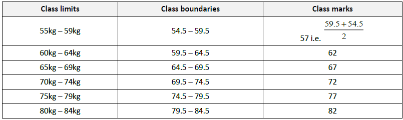
- However, if you decide on the intervals 55kg – 59kg, 60kg – 64kg, 65kg – 69kg, 70kg – 74kg, 75kg – 79kg and 80kg – 84kg, then the number of classes will be 6, with class width being 5kg. The numbers 50kg – 59kg, 60kg – 69kg etc. are called class limits.
- Determine the class boundaries. Some books do not differentiate between class boundaries and class limits. Class boundaries are the averages of limits of consecutive classes or intervals. For instance, the intervals 60kg – 64kg and 65kg – 69kg are consecutive. The class boundaries of the two will be
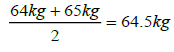
The class marks will be the midpoints of the resulting class boundaries. Doing this for the 6 classes will give the
following table:
Frequency tables are another form of basic analysis. These tables show the possible responses, the total number of respondents for each part, and the percentages of respondents who selected each answer. Frequency tables are useful when a large number of response options are available, or the differences between the percentages of each option are small. In most cases, pie or bar charts are easier to work with than frequency tables.
Cross tabulation
Cross tabulations, or cross tabs, are a good way to compare two subgroups of information. Cross tabs allow you to compare data from two questions to determine if there is a relation between them.
Relation is a set of ordered pairs, e.g.
Like frequency tables, cross tabs appear as a table of data showing answers to one question as a series of rows and answers to another question as a series of columns.
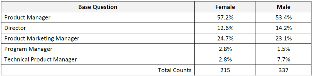
Cross tabs are used most frequently to look at answers to a question among various demographic groups. The intersections of the various columns and rows, commonly called cells, are the percentages of people who answered each of the responses. In the example above, females and males had relatively similar distribution among various job titles, with the exception of the tile of “Technical Product Manager”, where 2.5 times as many males had the title as compared to females. For analysis purposes, cross tabs are a great way to do comparisons.
Trend analysis
Depending on what type of information you are trying to know about your audience, you will have to decide what analysis makes sense. It can be as simple as reviewing the graphs, or conducting in-depth comparisons between questions sets to identify trends or relationships. For most surveyors, a basic analysis using charts, cross tabulations, and filters is sufficient.
Often, trends and patterns are more obvious and recommendations more effective when presented visually. Ideally, when making comparisons between one or more groups of respondents, it is best to show a chart of each group’s responses side-by-side. This side-by-side comparison allows your audience to quickly see the differences you are highlighting and will lead to more support for your conclusions.
COLLECT FINANCIAL AND DEMOGRAPHIC DATA
Financial data relevant to the unit
Whether you are selling vuvuzelas in Nigel or cuddly toys in Somerset West, as a manager, having the skills and means to manage the day-to-day numbers and financial data is vital.
By efficiently tracking your financial data you will be able to save money and avoid legal and financial problems.
What data is important?
Any data that will prevent your business unit from operating at a loss or acting inappropriately needs to be collected and analysed.
Running a business unit is like running a small business- it is all about making informed decisions quickly, based on real and up-to-date data.
If your sales data are wrong, then you will not be able to project your cash flow very accurately. The old adage of ‘rubbish in, rubbish out’ is just as applicable today as it has ever been.
A business normally tracks:
- Profitability
- Value of sales made
- Value of outstanding debts
- How much the business has spent
- How much the business owes to its suppliers
- How much the business is borrowing
- How much is in the bank (and in each account if you use current and high interest accounts)
- Major cash commitments; for example, you might need to service or renew equipment which will result in a large, unavoidable invoice some time in the future
Financial data and your business unit
You are in the best position to decide which key numbers you need to track to understand how your business unit is performing – financial data for your business unit3:
- Typically, a ‘people’ business (one that earns money from charging for people’s time) will want to monitor the value of work in progress (often abbreviated as WIP) in addition to the basics. WIP is the value of work done that you haven’t invoiced yet. Often the first thing you know about a problem with a customer or client is when there’s a problem getting an invoice paid. If you are building a large amount of WIP you might be in difficulty without knowing it. Good cash flow management means keeping WIP to a minimum.
- Typically, a sales and distribution business (one that buys products and sells them on – possibly in a repackaged form – for a profit) will want to monitor the following in addition to the basics:
Stock value. The value of stock held by the business that hasn’t been sold yet. High stock levels might be necessary in order to respond quickly to customer needs (especially if you stock a wide range of products that need to be provided to customers quickly or they will go somewhere else). However, high stock levels can also represent a major investment in cash with an impact on cash flow and profitability (if you cannot sell it for a decent profit). Monitoring stock levels for different products can also reveal overstocking of that product that might lead you to conduct a promotion while there is still a market for it.
Ratio of price to cost. The amount you charge for a product divided by the cost of its components. This is a rough and ready indicator of profitability. This figure might also show up an error in pricing.
Value of returns. A high level might indicate a flaw in the products or that you are mis-selling in some way.
Credit limits. If you deal with a large number of customers it can be difficult to keep track of how much each one owes you. Most companies therefore assign credit limits for each customer and investigate any new sale that breaches the credit limit to decide whether or not to accept the order
- Typically, a manufacturing business will track the same numbers as a sales and distribution business with the added complication of tracking:
- Manufacturing costs
- Sub-contract costs
- Manufacturing consumable costs
Demographic data relevant to the unit
As the business unit manager, the types of data you would be interested in would primarily relate to the following groups of people:
- Customers
- Employees
Customers – Any business exists to serve its customers and therefore needs to know who its target market is. For the purposes of this example4, three different businesses will be used to demonstrate what demographic customer information looks like. First the business type will be named, and then the sample demographic information:
- An upscale bakery in a trendy neighbourhood: Married, 30- to 50-year olds, R50 000 to R100 000 income that either work in the area or own homes in the area.
- Cell phone dating service: Single, 18- to 25-year-olds, R36 000 to R140 000 a year that rent or share rent with roommates.
- In-home medical care service: Single women, 65- to 86-year olds, higher-than-normal health needs but still living independently in their own home.
Employees – Demographic data you may be required to collect could relate to affirmative action and employment equity requirements; for example, race, gender and disability statistics.
You could also be looking at the data regarding age when planning your unit’s staffing needs, especially if many of your experienced, key personnel are nearing retirement age.
In addition, you could be assessing training needs and gather data related to schooling and qualifications.
RECORD FINANCIAL AND DEMOGRAPHIC DATA
Record financial data relevant to the unit
Spreadsheets are probably one of the most important tools available to you to help manage your business unit’s finances. When drawing up a spreadsheet, remember that the simpler the spreadsheet the fewer chances there will be for errors to creep in and the easier it will be to maintain.
Example5:
To track sales and billing you could create a spreadsheet with the following column names:
- Column 1 = Reference. This refers to your invoice number
- Column 2 = Paid? This can have a simple red/green colour code to indicate if an invoice has been paid. When an invoice is paid you simply turn the cell green and enter the date of payment
- Column 3 = Date. This is the date the invoice was raised
- Column 4 = Customer name
- Column 5 = Item sold. A brief description of the product or service supplied
- Column 6 = Goods. This is the total value of the goods including VAT
- Column 7 = Goods VAT. This is the VAT you are charging (if applicable). To calculate the VAT amount from a gross value divide by 114 and
- Column 8 = Goods ex-VAT
To track expenses or purchases you could create a spreadsheet with the following columns:
- Column 1 = Date. The date of the purchase
- Column 2 = Supplier details
- Column 3 = Notes. These explains in more detail, where needed, about the purchase Column 4 = Cheque number if paying by cheque
- Column 5 onwards = Listing of typical expenditure items such as heating, lighting, general expenses, travel, marketing
To track cash flow the spreadsheet will probably have the following columns:
- Column 1 = a list of the following: income, cash sales, capital or loans, other income. These would then be totalled going across the page in monthly columns. It will then list the expenditure such as materials, wages, insurances, postage, rent and rates. These would then be totalled in a similar monthly way to the income finance data
- Column 2 onwards = Monthly forecast and actual cash status. Each month will have a forecast and actual cash amount with the end of month actual being carried across to the next month. This way you can track the status of your cash flow month by month
Profit and loss accounts can be created from these two spreadsheets that will give you a month by month picture of the performance of your business unit and, hopefully, a final monthly profit number for you to sit back and enjoy.
Record demographic data relevant to the unit
Demographic data relating to your unit can usually be obtained from the Human Resources department.
The data is usually recorded in a codified format similar to the following:
Facility where qualifications were achieved:
01 = State / local institutions for persons with disabilities
02 = Primary school
03 = Secondary school
04 = College / technical college
05 = University
Career aspirations:
01 = Obtain full or part time paid employment
02 = Upgrade skills to enable retention of current job
04 = Obtain grade 12 or equivalent
05 = Obtain a degree
06 = Enter post-matric education
07 = Improve academic / literacy skills
APPLYING MATHEMATICAL TECHNIQUES TO CALCULATE AND REPRESENT DATA
Before a large number of observations can be analysed, they must be sorted into a convenient number of groups, or classes.
The data must be sorted according to the numerical value of some characteristic, called a variable.
Variables are things that we measure, control, or manipulate in research. They differ in many respects, most notably in the role they are given in our research and in the type of measures that can be applied to them.
Thus a number of people might be sorted according to their height, age, weight, or any other characteristic capable of being measured.
Variables differ in “how well” they can be measured, i.e. in how much measurable information their measurement scale can provide. There is obviously some measurement error involved in every measurement, which determines the “amount of information” that we can obtain. Another factor that determines the amount of information that can be provided by a variable is its “type of measurement scale.” Specifically variables are classified as: (a) nominal, (b) ordinal, (c) interval or (d) ratio.
Nominal variables allow for only qualitative classification. That is, they can be measured only in terms of whether the individual items belong to some distinctively different categories, but we cannot quantify or even rank order those categories. For example, all we can say is that two individuals are different in terms of variable A (e.g. they are of different races), but we cannot say which one “has more” of the quality represented by the variable. Typical examples of nominal variables are gender and race.
Ordinal variables allow us to rank order the items we measure in terms of which has less and which has more of the quality represented by the variable, but still they do not allow us to say “how much more.” A typical example of an ordinal variable is the socio-economic status of families. For example, we know that upper-middle is higher than middle, but we cannot say that it is, for example, 18% higher.
Interval variables allow us not only to rank order the items that are measured, but also to quantify and compare the sizes of differences between them. For example, temperature, as measured in degrees Celsius, constitutes an interval scale. We can say that a temperature of 40 degrees is higher than a temperature of 30 degrees, and that an increase from 20 to 40 degrees is twice as much as an increase from 30 to 40 degrees.
Ratio variables are very similar to interval variables; in addition to all the properties of interval variables, they feature an identifiable absolute zero point, thus they allow for statements such as x is two times more than y. Typical examples of ratio scales are measures of time or space. For example, as the Kelvin temperature scale is a ratio scale, not only can we say that a temperature of 200 degrees is higher than one of 100 degrees, but we can also correctly state that it is twice as high. Interval scales do not have the ratio property. Most statistical data analysis procedures do not distinguish between the interval and ratio properties of the measurement scales.
The number of items in any group is called the frequency of that group, and the resulting distribution is called the frequency distribution.
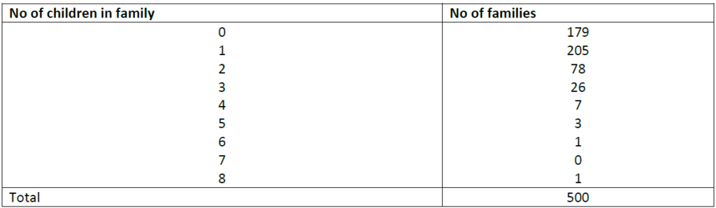
Here is a simple example of a frequency distribution showing 500 families classified according to the number of children in the family.
Frequency distribution of 500 families
Continuous and discrete variables
A variable that can take only discrete (whole) values, is called discrete or discontinuous- a man cannot have 6.3 children, there cannot be 5.2 houses in the street, or 3.5 rooms in a house.
A continuous variable, on the other hand, can take any value within a range- temperature need not be an exact number of degrees, but may be measured to several decimal places, e.g. 37.5°C and every object whose temperature is rising or falling will, during the process, take every possible temperature between the final and initial values. Similar examples are the speed of a vehicle and the height of a growing plant. In other words, a continuous variable can take an infinite number of values.
Statisticians use summary measures to describe patterns of data. Measures of central tendency refer to the summary measures used to describe the most “typical” value in a set of values. The two most common measures of central tendency are the mean and the median.
CALCULATE AVERAGES AND STANDARD DEVIATIONS
Mean is the average value within an entire or partial series. It is commonly referred to as the “average” and calculated by adding up all the totals and dividing by the number of items: 1+2+3+4+5=15 5 = 3 For example:
Let’s say you are writing about Best Meat Co. and the salaries of its nine employees.
The CEO makes R700 000 per year
Two managers each make R350 000 per year
Four factory workers each make R105 000 per year
Two apprentices make R63 000 per year.
So you add R700 000 + R350 000 + R350 000 + R105 000 + R105 000 + R105 000 + R105 000 + R63 000 + R63 000 (all the values in the set of data), which gives you R1 946 000. Then divide that total by 9 (the number of values in the set of data).
That gives you the mean (average), which is R216 222.
Not a bad average salary. But be careful when using this number. After all, only three of the nine workers at ABC make that much money. And the other six workers don’t even make half the average salary.
So what statistic should you use when you want to give some idea of what the average worker at ABC is earning? This is where the median comes in.
Median
The median of a sequence of items is the middle item after the entire sequence has been arranged in either ascending or descending order. This is often used to measure the location for a frequency or probability distribution.
For example:
If 37 items are arrayed in order of magnitude, the median is the value of the middle one, i.e. of the 19th. If there are 38 items, there are two that have an equal claim to be central, namely the 19th and the 20th, so the median is taken as the average of these two.
Therefore, if five men shoot and score 48,55,59,67 and 70, the median score is 59, but if a 6th man scores 62, the median is ½ (59+62), which is 60,5.
Whenever you find yourself referring to “the average worker” this, or “the average household” that, you don’t want to use the mean to describe those situations. You want a statistic that tells you something about the worker or the household in the middle. That’s the median.
Again, this statistic is easy to determine because the median literally is the value in the middle. Just line up the values in your set of data, from largest to smallest, or in descending order the one in the dead-centre is the median.
For the Best Meat Co., here are the workers’ salaries again, written in descending order:
R700 000
R350 000
R350 000
R105 000
R105 000
R105 000
R105 000
R63 000
R63 000
That’s a total of 9 employees. So the one halfway down the list, the fifth value, is R105 000. That’s the median. (If halfway lies between two numbers, divide them by two, e.g. R105 000 and R90 000 would give you a median of R97 500)
Comparing the mean to the median for a set of data can give you an idea how widely the values in your dataset are spread apart. In this case, there’s a somewhat substantial gap between the CEO at Best Meat Co. and the workers. (Of course, in the real world, a set of just nine numbers won’t be enough to tell you very much about anything. But we’re using a small dataset here to help keep these concepts clear.)
Here’s another illustration of this: Ten people are riding on a bus in Kraaifontein. The mean income of these passengers is R90 000 a year. The median income of those riders is also R90 000 a year. Joe Soap gets off the bus. Patrice Motsepe gets on. The median income of the passengers remains R90 000 a year. But the mean income is now somewhere in the neighbourhood of R20 million or so. You now could say that the average income of the passengers is R20 million, but those other nine passengers didn’t become millionaires just because Patrice Motsepe got on their bus.
As measures of central tendency, the mean and the median each have advantages and disadvantages. The pros and cons of each measure are summarised below:
The median may be a better indicator of the most typical value if a set of scores has an outlier. An outlier is an extreme value that differs greatly from other values; for example, Patrice Motsepe’s income in the example above.
However, when the sample size is large and does not include outliers, the mean score usually provides a better measure of central tendency.
The max (maximum) is the largest value in a series of numbers
Min (minimum) is the smallest value in your dataset
Mode is the value or values that appear most frequently within your data set
Range is the difference between the Max and Min in a series of numbers. The formula for range is: Range = Max – Min; for example, consider the following numbers: 1, 3, 4, 5, 5, 6, 7, 11. For this set of numbers, the range would be 11 – 1 or 10
Calculate the standard deviation
The standard deviation is the average of all the averages of several sets of data. Statisticians use the standard deviation to calculate how close the various sets of data are to the mean of all the data sets.
Standard Deviation
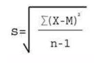
Where
Σ = Sum of X = Individual score M = Mean of all scores N = Sample size (Number of scores)
First, you need to determine the mean. The mean of a list of numbers is the sum of those numbers divided by the quantity of items in the list (add all the numbers up and divide by how many there are).
Then, subtract the mean from every number to get the list of deviations. Create a list of these numbers. It’s OK to get negative numbers here. Next, square the resulting list of numbers (multiply them with themselves).
Add up all of the resulting squares to get their total sum. Divide your result by one less than the number of items in the list.
To get the standard deviation, just take the square root of the resulting number Example: List of numbers: 1, 3, 4, 6, 9, 19 Mean: (1+3+4+6+9+19) / 6 = 42 / 6 = 7 List of deviations: -6, -4, -3, -1, 2, 12 Squares of deviations: 36, 16, 9, 1, 4, 144 Sum of deviations: 36+16+9+1+4+144 = 210 Divided by one less than the number of items in the list: 210 / 5 = 42 Square root of this number: square root (42) = The standard deviation is about 6.48
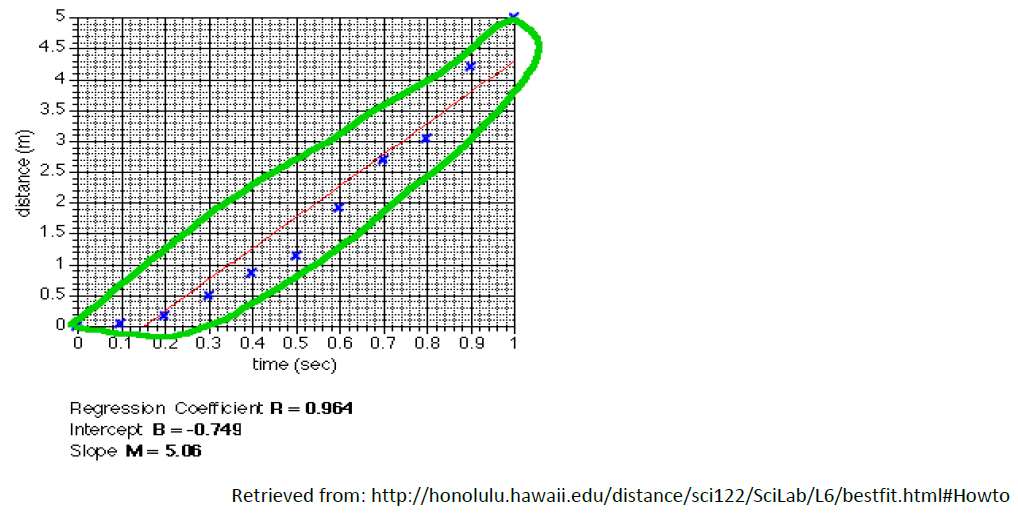
CALCULATE THE LINES OF BEST FIT
At times trends are difficult to determine by just looking at tables. Then it is useful to draw a line of “best fit”. A line of best fit (or “trend” line) is a straight line that best represents the data on a scatter plot (see 2.3 for information on scatter plots). This line may pass through some of the points, none of the points, or all of the points, but it gives you a good idea of the trend displayed by the data.
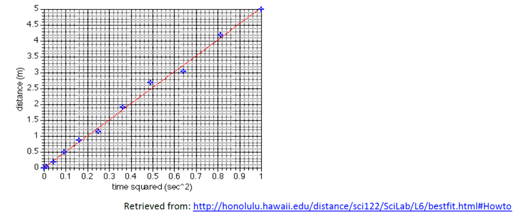
How to draw the “Best Fit Line”
The easiest way to draw the best fit line is to enter the data into the computer and let the software do the work. If you don’t have the software or don’t know how to use it you can still estimate the regression line.
Imagine that the points enclose an area, then cut that area in half. If you use a ruler to draw the line you can move it around until you find a place where approximately half the points are on each side of the line, as in the example below:
PERFORM CALCULATIONS RELATING TO THE TIME VALUE OF MONEY
The time value of money is a fundamental idea in finance that money that one has now is worth more than money one will receive in the future. Because money can earn interest or be invested, it is worth more to an economic actor if it is available immediately. This concept applies to many contracts; for example, a trade in which payment is delayed will often require compensation for the time value of money. This concept may be thought of as a financial application of the saying, “A bird in the hand is worth two in the bush.
Time value of money is also to as present discounted value.
Example:
Everyone knows that money deposited in a savings account will earn interest. Because of this, the sooner it starts earning interest, the better. For example, assuming a 5% interest rate, a R100 investment today will be worth R105 in one year (R100 multiplied by 1.05). Conversely, R100 received one year from now is worth only R95.24 today (R100 divided by 1.05), assuming a 5% interest rate6.
Even though there are many useful methods for calculating the time value of money, we will look at the following methods in this section:
- Present value (PV) of an annuity stream
- The Rule of 72
How to calculate the present value of an annuity stream
Say you want to live on R500 000 per year from your investments once you retire. Let’s say you are going to retire at age 60 and expect to need the money for 25 years. We will also say that you expect to get a 5% return on your money. Now, how much money do you need at age 60 to be able to meet your goal?
Well, if you were to put all your money under your mattress where it got zero return, you would need R11 250 000 (R500 000 X 25 years = R11 250 000). You would stick R11 250 000 under your mattress and each year take out R500 000 to spend. At the end of 20 years, you would have nothing left.
However, if you are like most people, you probably want to get some sort of return on your money. To do this calculation, we have to use the following formula:
(1/i) – [1/(i X (1 + i)n)]
The “i” stands for expected interest rate, which is 5% (.05). The “n” stands for the number of periods, which is 25 years. The “X” is the multiplication sign. So, using real numbers, the equation would look like this:
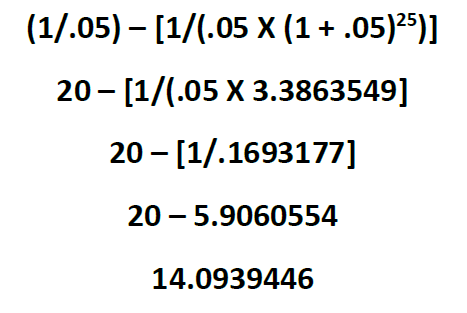
14.0939446 is our “factor.” To get the amount of money we need at age 60 to fund this income stream, you multiply R500 000 by the factor (14.0939446). So, for this example, we need R7 046 972 in the bank at age 60 in order to fund an annual income of R500 000 for 25 years.
Remember: At the end of 25 years, the money will be gone- so if you plan on living till age 90, you will need to make a plan!
The rule of 72
In finance, the rule of 728, the rule of 70 and the rule of 69 are methods for estimating an investment’s doubling time. The number in the title is divided by the interest percentage per period to obtain the approximate number of periods (usually years) required for doubling. Although scientific calculators and spreadsheet programs have functions to find the accurate doubling time, the rules are useful for mental calculations and when only a basic calculator is available.
These rules apply to exponential growth and are therefore used for compound interest as opposed to simple interest calculations. They can also be used for decay to obtain a halving time. The choice of number is mostly a matter of preference: 69 is more accurate for continuous compounding, while 72 works well in common interest situations and is more easily divisible.
To estimate the number of periods required to double an original investment, divide the most convenient “rule-quantity” by the expected growth rate, expressed as a percentage.
- For instance, if you were to invest R100 with compounding interest at a rate of 9% per annum, the rule of 72 gives 72/9 = 8 years required for the investment to be worth R200; an exact calculation gives 8.0432 years.
- Similarly, to determine the time it takes for the value of money to halve at a given rate, divide the rule quantity by that rate.
- To determine the time for money’s buying power to halve, financiers simply divide the rule-quantity by the inflation rate. Thus at 3.5% inflation using the rule of 70, it should take approximately 70/3.5 = 20 years for the value of a unit of currency to halve.
- To estimate the impact of additional fees on financial policies (e.g., unit trust/ participatory interests fees and expenses), divide 72 by the fee. For example, if the policy charges a 3% fee over and above the cost of the underlying investment fund, then the total account value will be cut to 1/2 in 72 / 3 = 24 years, and then to just 1/4 the value in 48 years, compared to holding the exact same investment outside the time.
- The value 72 is a convenient choice of numerator, since it has many small divisors: 1, 2, 3, 4, 6, 8, 9, and 12. It provides a good approximation for annual compounding, and for compounding at typical rates (from 6% to 10%). The approximations are less accurate at higher interest rates.
REPRESENT DATA COLLECTED AND CALCULATIONS IN A GRAPHICAL FORMAT
It is essential to take the data that you have collected, recorded and organised and represent it in a table, chart, plot or graph that can easily be interpreted.
The method used to represent the data depends on the nature of the data gathered. There are several ways of representing data. Let us look at a few of them.
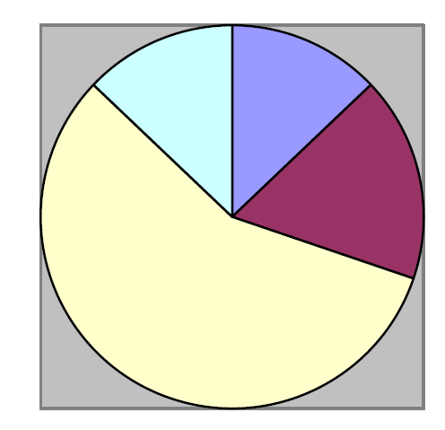
Pie charts
This type of chart depicts how an aggregate is divided into its principal components. The various items are proportional to the areas representing them in the circle, or to the angles of the various sectors. They can be converted into percentages by dividing the angles at the centre by 360 and multiplying by 100, i.e. if the angle is 45°, we can divide 45 by 360 X 100, which equals 12.5%. Alternatively, we can determine the angle by multiplying 360° with the percentage and dividing by 100:
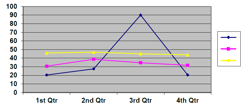
Line graphs
The most common type of chart in economic and commercial statistics is that of the time series, showing the progress of one or more quantities at successive times, usually at regular intervals.
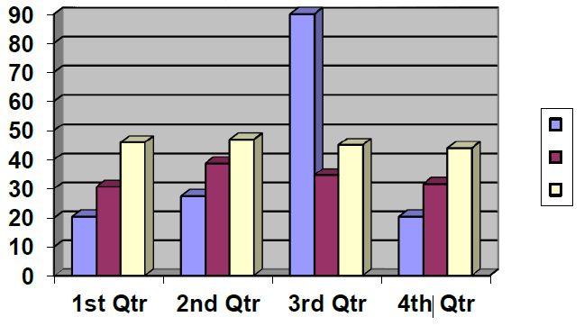
Bar charts
In the simplest form of bar chart, several items are shown graphically by horizontal or vertical bars of uniform width, with lengths proportional to the values they represent:
To represent data using a bar chart:
Step 1: Determine which variable is dependent and which is independent. Place the independent variable on the x-axis and the dependent variable on the y-axis. The independent variable is often “time”. The dependent variable may be something like “production output”. Think about it: No-one has any control over the march of time. So time marches on whether we like it or not. The march of time is independent, or happens regardless of, any human activity. (The dependent variable is usually something that humans have accomplished or are trying to accomplish.)
Step 2: Set the range of the data points gathered for the dependent variable along the y-axis.
Step 3: Make sure that the categories for the x-axis and the measurements along the y-axis are evenly spaced. The vertical and horizontal axes must always be labelled properly, as in our example.
Stack bar charts
Another way to represent data is through stacking. In this way, a single bar on the chart can show data for more than one category of data. For example, a single bar can represent the amount of sales for CD-ROM drives in one year on top of a bar representing sales for other years. You can stack the bar charts vertically or horizontally.
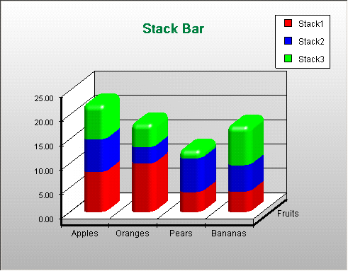
Retrieved from: http://www2.nevron.com/ChartActiveXHelp/3dchartStack_Bar_Chart.htm
Histograms
The difference between a bar chart and a histogram is that a histogram is used exclusively to represent frequency.
The graph below is an example of the way a histogram might be used to show the test results of a group of students.
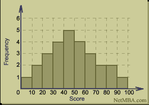
Retrieved from: http://www.netmba.com/statistics/histogram/
The number of students who achieved between 40-50% for the exam is 5. Only 1 student achieved between 90 and 100%.
To represent data using a histogram:
- First, make sure that you are trying to represent the frequency of a certain occurrence.
- The independent variable will always be represented along the x-axis. In the case of a histogram this would always be a measure of time or period.
- Along the y-axis would be the frequency, that is, the number of occurrences of a particular event. This is the dependent variable.
Note: What is the meaning of the term “independent variable”? What is the meaning of the term “dependent variable”?
No matter what you are trying to investigate, you will find that one thing depends on another. Let’s think: What is the state of your physical fitness? That would depend on how you live. If you are too lazy to exercise, if you eat mostly junk foods, if you smoke, if you drink alcohol to excess, you will in all likelihood be very unfit indeed. In this simple example your lifestyle choices are the independent variable. Your state of physical fitness depends on your lifestyle choices, and is therefore the dependent variable.
In mathematics, we often write equations like this: . We say that is a function of . That is, the value of depends on the value we assign to . We call the independent variable, and the dependent variable. The independent variable is always placed on the horizontal axis, and the dependent variable on the vertical axis.
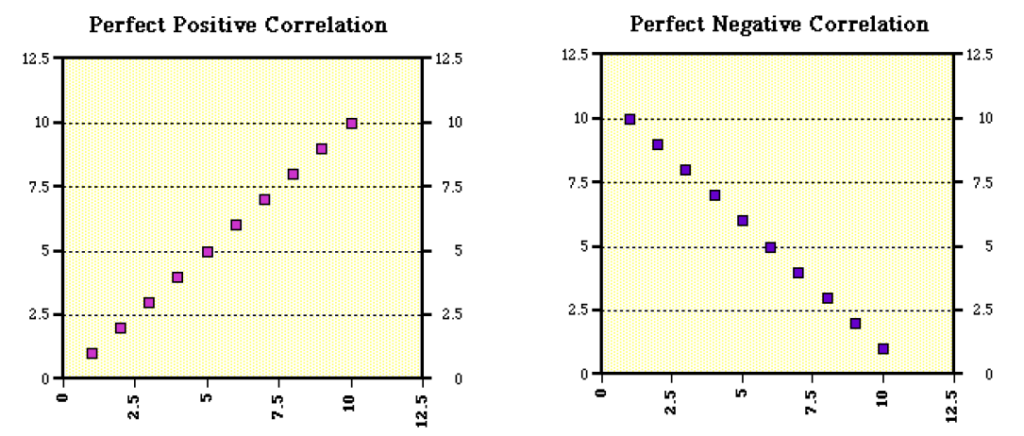
Scatter diagram/plot
Scatter plots are similar to line graphs in that they use horizontal and vertical axes to plot data points. However, they have a very specific purpose. Scatter plots show how much one variable is affected by another. The relationship between two variables is called their correlation.
Scatter plots usually consist of a large body of data. The closer the data points come when plotted to making a straight line, the higher the correlation between the two variables, or the stronger the relationship.
If the data points make a straight line going from the origin out to high x- and y-values, then the variables are said to have a positive correlation. If the line goes from a high-value on the y-axis down to a high-value on the x-axis, the variables have a negative correlation.
Retrieved from: http://mste.illinois.edu/courses/ci330ms/youtsey/scatterinfo.html
An example of a situation where you might find a perfect positive correlation, as we have in the graph on the left, would be when you compare the total amount of money spent on tickets at the movie theatre with the number of people who go. This means that every time that “x” number of people go, “y” amount of money is spent on tickets without variation.
An example of a situation where you might find a perfect negative correlation, as in the graph on the right, would be if you were comparing the speed at which a car is going to the amount of time it takes to reach a destination. As the speed increases, the amount of time decreases.
Tips for Creating Effective Graphics
The key to creating effective data graphics is the combination of good graphic design and appreciation of statistics that Edward Tufte (in his seminal books The Visual Display of Quantitative Information and Envisioning Information) defined as graphical integrity.
Apply the following principles to ensure graphical integrity and graphical excellence:
- It is essential to focus on the substance (contents) of the graph – not on the design, methodology or technology.
- It is essential to avoid distortion induced by the format of the graph.
- It is desirable to aim for what he termed high data density, whereby the graph is used to present – as no other method can – large amounts of data in a coherent manner.
- It is worthwhile constructing graphs that not only present data in a `static’ from, but that encourage comparisons between variables, location, or time periods.
- It is desirable to allow the viewer to discover levels of detail within the graph.
- It is necessary to make the graph serve a single, clear purpose, such as data description, tabulation, exploration or decoration.
- It is important to integrate the graph with statistical and textual descriptions.
- Above all, it is vital that the graph should show the data, not the technical skills of its creator.
APPLYING MATHEMATICAL ANALYSIS TO INDICATE ECONOMIC RELATIONSHIPS
The sequence from data to knowledge is: from Data to Information, from Information to Facts, and finally, from Facts to Knowledge. Data becomes information, when it becomes relevant to your decision making. Information becomes fact, when the data can support it. Facts are what the data reveals. However, the decisive instrumental (i.e., applied) knowledge is expressed together with some statistical degree of confidence.
Fact becomes knowledge, when it is used in the successful completion of a decision process.
The following figure illustrates the statistical thinking process based on data in constructing statistical models for decision making under uncertainties.
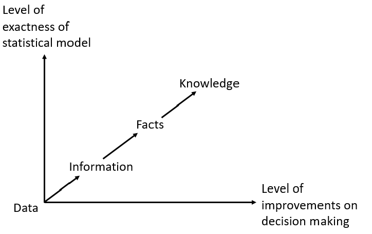
The above figure depicts the fact that as the exactness of a statistical model increases, the level of improvements in decision-making increases. That’s why we need Business and Economic Statistics. Statistics arose from the need to place knowledge on a systematic evidence base. This required a study of the rules of computational probability, the development of measures of data properties and relationships, and so on.
To reason statistically – which is essential to be an informed citizen, employee, and consumer – we all need to learn about data analysis and related aspects of probability.
The amount of statistical information available to help make decisions in business, politics, research, and everyday life is staggering. Consumer surveys guide the development and marketing of products. Experiments evaluate the safety and efficacy of new medical treatments. Statistics sway public opinion on issues and represent – or misrepresent – the quality and effectiveness of commercial products. Through experiences with the collection and analysis of data, we learn how to interpret such information.
INDICATE ECONOMIC RELATIONSHIPS THROUGH GRAPHICAL REPRESENTATION
In economics, graphs and charts are used to simplify complex data.
Economists employ different types of graphs and charts, depending upon the range of data and multiplicity of variables. Some of these are:
- Flowcharts
- Scatter diagrams
- Time-series graphs
- Box plots
Flowchart
Flowcharts are used most commonly in business, to represent the internal logical organisation of a system. However, they can be used in any situation where we wish to represent connected structures where there may be alternative pathways through the system. We can also indicate quantitative aspects of the flow of information or materials through the structure by annotating the diagram, or varying the line style or thickness to indicate quantity.
In economics, the flowchart helps to explain how different components of economics interact under particular market situations
Most flow charts are made up of three main types of symbols:
Elongated circles, which signify the start or end of a process;
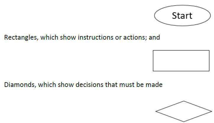
Within each symbol, write down what the symbol represents. This could be the start or finish of the process, the action to be taken, or the decision to be made.
However, remember that there are many different flowchart symbols that can be used. Therefore, remember that an important use of flow charts is in communication: If you use obscure symbols that only part of your audience understands, there’s a good chance that your communication will fail. Always keep things simple!
Symbols are connected one to the other by arrows, showing the flow of the process.
To draw the flow chart, brainstorm process tasks, and list them in the order they occur. Ask questions such as “What really happens next in the process?” and “Does a decision need to be made before the next step?” or “What approvals are required before moving on to the next task?”
Start the flow chart by drawing the elongated circle shape, and labelling it “Start”.
Then move to the first action or question, and draw a rectangle or diamond appropriately. Write the action or question down, and draw an arrow from the start symbol to this shape.
Work through your whole process, showing actions and decisions appropriately in the order they occur, and linking these together using arrows to show the flow of the process. Where a decision needs to be made, draw arrows leaving the decision diamond for each possible outcome, and label them with the outcome. And remember to show the end of the process using an elongated circle labelled “Finish”.
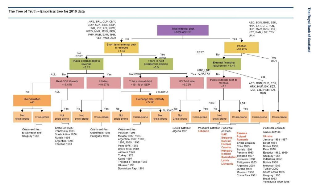
Example: The “Tree of Truth”
According to the Royal Bank of Scotland, the flowchart below is aimed at selecting explanatory variables and critical threshold levels that best discriminate between sovereign debt crisis and non-sovereign debt crisis states.
In basic terms it’s a flowchart, showing which countries in Central Eastern Europe, the Middle East and Africa, the bank thinks are potentially vulnerable to a sovereign debt crisis.
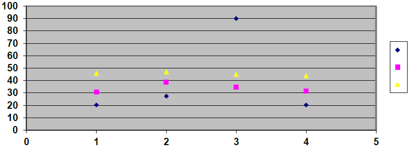
Scatter diagram
Scatter Plots are incredibly useful graphs for examining large data sets. Reports and standard table displays are hard and time-consuming to interpret, and aggregations of the data — which can make reports and tables easier to understand — can mask outliers, correlations and trends and make them difficult or impossible to see.
Scatter Plots are an excellent information visualisation to select when you are looking for positive and negative correlations, trends and outliers in large statistical databases. They are particularly useful in financial services applications.
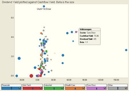
Retrieved from: http://www.panopticon.com/products/scatter_plot_data_visualization_software.htm
This Scatter Plot maps Dividend Yield on the Y axis and Cash flow Yield on the X axis. Colour is used to differentiate companies by sector. Each point represents a single company, and the size of each circle corresponds to the market cap for that company compared to all other companies in the dataset. This Scatter Plot makes it easy to see that Volkswagen is performing very well in terms of Cash flow and Dividends, and that Lloyds TSB is the leader by far in terms of Yield.
Time-series graphs
They are good at showing specific values of data, meaning that given one variable the other can easily be determined. Trends in data are also shown clearly, meaning that they visibly show how one variable is affected by the other as it increases or decreases. Time series graphs enable the viewer to make predictions about the results of data not yet recorded.
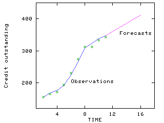
Retrieved from: http://home.ubalt.edu/ntsbarsh/stat-data/Forecast.htm#rintroductionf
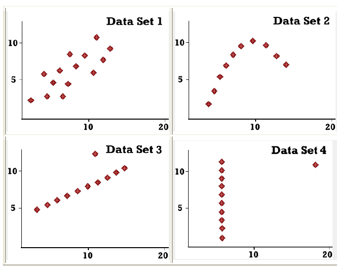
The most graphic way of seeing just how useful graphical data presentation can be is by trying to ‘picture’ the structure of any of the four data sets shown below purely by looking at the columns of figures:
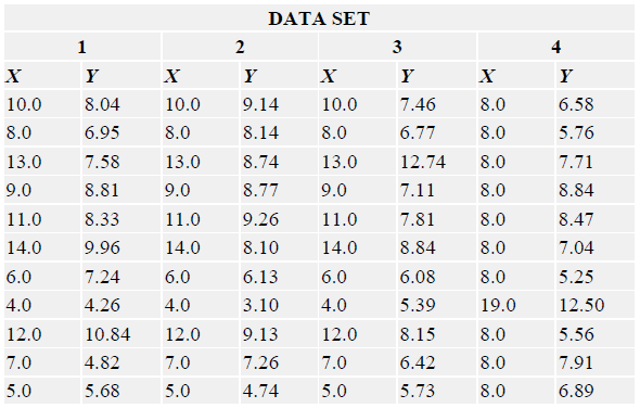
It is only when we come to graph these data sets, as the series of scatter graphs, that we really appreciate how deceptive the numbers alone can be, and how valuable the graphical format can be.
ACCURATE GRAPHICAL REPRESENTATIONS AND NUMERICAL SUMMARIES
We have seen how to represent information graphically. In this section we will look at a simple method to represent and analyse numerical data, namely the Stem and Leaf Plot:
A stem-and-leaf plot is a display that organises data to show its shape and distribution. In a stem-and-leaf plot each data value is split into a “stem” and a “leaf”. The “leaf” is usually the last digit of the number and the other digits to the left of the “leaf” form the “stem”. The number 123 would be split as:
stem 12
leaf 3
Example:
Math test scores out of 50 points:
35, 36, 38, 40, 42, 42, 44, 45, 45, 47, 48, 49, 50, 50, 50
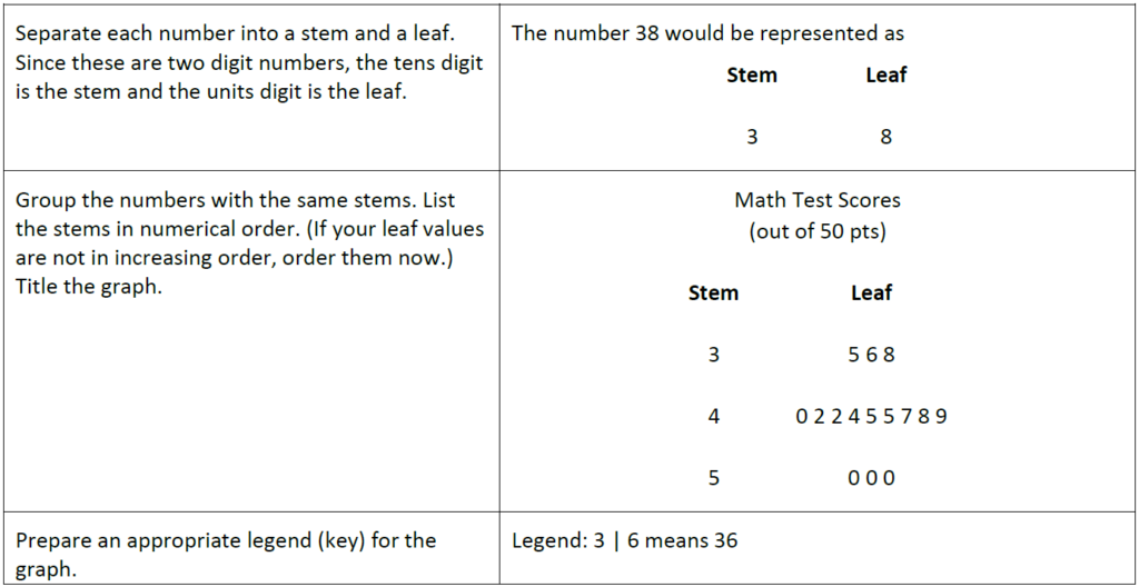
A stem-and-leaf plot shows the shape and distribution of data. It can be seen in the diagram above that the data clusters around the row with a stem of 4.
- The leaf is the digit in the place farthest to the right in the number, and the stem is the digit, or digits, in the number that remain when the leaf is dropped
- To show a one-digit number (such as 9) using a stem-and-leaf plot, use a stem of 0 and a leaf of 9
- To find the median in a stem-and-leaf plot, count off half the total number of leaves
Example
MAKE PROJECTIONS ON THE BASIS OF MATHEMATICAL ANALYSIS
The solution to many statistical experiments involves being able to count the number of points in a sample space. Counting points can be hard, tedious, or both. Fortunately, there are ways to make the counting task easier. This section focuses on three rules of counting that can save both time and effort – event multiples, permutations, and combinations.
The first rule of counting deals with event multiples. An event multiple occurs when two or more independent events are grouped together. The first rule of counting helps us determine how many ways an event multiple can occur.
Rule 1.
Suppose we have k independent events. Event 1 can be performed in n1 ways; Event 2, in n2 ways; and so on up to Event k (which can be performed in nk ways). The number of ways that these events can be performed together is equal to n1n2 . . . nk ways.
Examples
- How many sample points are in the sample space when a coin is flipped 4 times?
Each coin flip can have one of two outcomes – heads or tails. Therefore, the four coin flips can land in (2)(2)(2)(2) = 16 ways. - A business man has 4 dress shirts and 7 ties. How many different shirt/tie outfits can he create?
For each outfit, he can choose one of four shirts and one of seven ties. Therefore, the business man can create (4)(7) = 28 different shirt/tie outfits.
Often, we want to count all of the possible ways that a single set of objects can be arranged.
Consider the letters X, Y, and Z. These letters can be arranged a number of different ways (XYZ, XZY, YXZ, etc.) Each of these arrangements is a permutation. - In general, n objects can be arranged in n(n – 1)(n – 2) … (3)(2)(1) ways. This product is represented by the symbol n!, which is called n factorial. (By convention, 0! = 1.)
A permutation is an arrangement of all or part of a set of objects, with regard to the order of the arrangement.
The number of permutations of n objects taken r at a time is denoted by nPr.
Rule 2.
The number of permutations of n objects taken r at a time is
nPr = n(n – 1)(n – 2) … (n – r + 1) = n! / (n – r)!
Examples
- How many different ways can you arrange the letters X, Y, and Z?
One way to solve this problem is to list all of the possible permutations of X, Y, and Z. They are:
XYZ, XZY, YXZ, YZX, ZXY, and ZYX
Thus, there are 6 possible permutations.
Another approach is to use Rule 2. Rule 2 tells us that the number of permutations is n! / (n – r)!.
We have 3 distinct objects so n = 3
And we want to arrange them in groups of 3, so r = 3
Thus, the number of permutations is 3! / (3 – 3)! or 3! / 0!. This is equal to (3)(2)(1)/1 = 6 - In horse racing, a trifecta is a type of bet. To win a trifecta bet, you need to specify the horses that finish in the top three spots in the exact order in which they finish. If eight horses enter the race, how many different ways can they finish in the top three spots?
Rule 2 tells us that the number of permutations is n! / (n – r)!
We have 8 horses in the race. so n = 8
And we want to arrange them in groups of 3, so r = 3
Thus, the number of permutations is 8! / (8 – 3)! or 8! / 5!
This is equal to (8)(7)(6) = 336 distinct trifecta outcomes. With 336 possible permutations, the trifecta is a difficult bet to win
Sometimes, we want to count all of the possible ways that a single set of objects can be selected – without regard to the order in which they are selected.
A combination is a selection of all or part of a set of objects, without regard to the order in which they were selected.
The number of combinations of n objects taken r at a time is denoted by nCr.
Rule 3.
The number of Combinations of n objects taken r at a time is
nCr = n(n – 1)(n – 2) … (n – r + 1)/r! = n! / r!(n – r)! = nPr / r!
Examples - How many different ways can you select 2 letters from the set of letters: X, Y, and Z?
One way to solve this problem is to list all of the possible selections of 2 letters from the set of X, Y, and Z.
They are: XY, XZ, and YZ. Thus, there are 3 possible combinations
Another approach is to use Rule 3. Rule 3 tells us that the number of combinations is n! / r!(n – r)!.
We have 3 distinct objects so n = 3
And we want to arrange them in groups of 2, so r = 2 - Thus, the number of combinations is 3! / 2!(3 – 3)! or 3! /2!0!
- This is equal to (3)(2)(1)/(2)(1)(1) = 3
- Five-card stud is a poker game, in which a player is dealt 5 cards from an ordinary deck of 52 playing cards. How many distinct poker hands could be dealt?
For this problem, it would be impractical to list all of the possible poker hands. However, the number of possible poker hands can be easily calculated using Rule 3.
Rule 3 tells us that the number of combinations is n! / r!(n – r)!.
We have 52 cards in the deck so n = 52
And we want to arrange them in groups of 5, so r = 5
Thus, the number of permutations is 52! / (52 – 5)! or 52! / 5!47!
This is equal to 2,598,960 distinct poker hands
Probability of a sample point
The probability of a sample point is a measure of the likelihood that the sample point will occur.
By convention, statisticians have agreed on the following rules.
The probability of any sample point can range from 0 to 1
The sum of probabilities of all sample points in a sample space is equal to 1
Examples - Suppose we conduct a simple statistical experiment. We flip a coin one time. The coin flip can have one of two outcomes – heads or tails. Together, these outcomes represent the sample space of our experiment. Individually, each outcome represents a sample point in the sample space. What is the probability of each sample point?
The sum of probabilities of all the sample points must equal 1. And the probability of getting a head is equal to the probability of getting a tail. Therefore, the probability of each sample point (heads or tails) must be equal to 1/2. - Let’s repeat the experiment of the above example, with a die instead of a coin. If we toss a fair die, what is the probability of each sample point? For this experiment, the sample space consists of six sample points: {1, 2, 3, 4, 5, 6}. Each sample point has equal probability. And the sum of probabilities of all the sample points must equal 1. Therefore, the probability of each sample point must be equal to 1/6.
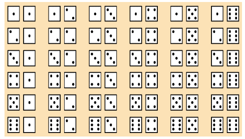
- If we should use two die in an experiment, the following combinations would be probable (equally likely outcomes when rolling two dice):
Probability of an event
The probability of an event is a measure of the likelihood that the event will occur. By convention, statisticians have agreed on the following rules.
The probability of any event can range from 0 to 1
The probability of event A is the sum of the probabilities of all the sample points in event A
The probability of event A is denoted by P(A)
Thus, if event A were very unlikely to occur, then P(A) would be close to 0. And if event A were very likely to occur, then P(A) would be close to 1.
Examples
- Suppose we draw a card from a deck of playing cards. What is the probability that we draw a spade?
The sample space of this experiment consists of 52 cards, and the probability of each sample point is 1/52. Since there are 13 spades in the deck, the probability of drawing a spade is
P(A) = (13)(1/52) = 1/4 - Suppose a coin is flipped 3 times. What is the probability of getting two tails and one head?
For this experiment, the sample space consists of 8 sample points.
S = {TTT, TTH, THT, THH, HTT, HTH, HHT, HHH}
Each sample point is equally likely to occur, so the probability of getting any particular sample point is 1/8. The event “getting two tails and one head” consists of the following subset of the sample space.
A = {TTH, THT, HTT}
The probability of Event A is the sum of the probabilities of the sample points in A. Therefore,
P(A) = 1/8 + 1/8 + 1/8 = 3/8
Rules of probability
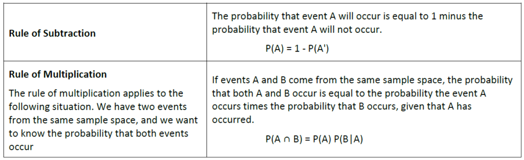
Often, we want to compute the probability of an event from the known probabilities of other events. This section covers some important rules that simplify those computations.
Before discussing the rules of probability, we state the following definitions:
Two events are mutually exclusive if they have no sample points in common
The probability that Event A occurs, given that Event B has occurred, is called a conditional probability
The conditional probability of A, given B, is denoted by the symbol P(A|B)
The probability that event A will not occur is denoted by P(A’)
Note:
The probability of a sample point ranges from 0 to 1
The sum of probabilities of all the sample points in a sample space equals 1
Examples
- A bowl contains 6 red marbles and 4 black marbles. Two marbles are drawn without replacement from the bowl. What is the probability that both of the marbles are black?
Let A = the event that the first marble is black; and let B = the event that the second marble is black. We know the following:
In the beginning, there are 10 marbles in the urn, 4 of which are black. Therefore, P(A) = 4/10.
After the first selection, there are 9 marbles in the urn, 3 of which are black. Therefore, P(B|A) = 3/9.
Therefore, based on the rule of multiplication:
P(A ∩ B) = P(A) P(B|A)
P(A ∩ B) = (4/10)*(3/9) = 12/90 = 2/15 - Suppose we repeat the experiment of the example above; but this time we select marbles with replacement. That is, we select one marble, note its colour, and then replace it in the bowl before making the second selection. When we select with replacement, what is the probability that both of the marbles are black?
Let A = the event that the first marble is black; and let B = the event that the second marble is black. We know the following:
In the beginning, there are 10 marbles in the urn, 4 of which are black. Therefore, P(A) = 4/10.
After the first selection, we replace the selected marble; so there are still 10 marbles in the urn, 4 of which are black. Therefore, P(B|A) = 4/10.
Therefore, based on the rule of multiplication:
P(A ∩ B) = P(A) P(B|A)
P(A ∩ B) = (4/10)*(4/10) = 16/100 = 4/25
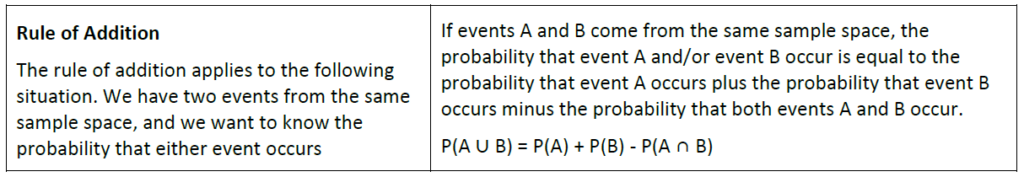
Note: Invoking the fact that P( A ∩ B ) = P( A )P( B | A ), the Addition Rule can also be expressed as
P(A ∪ B) = P(A) + P(B) – P(A)P( B | A )
Examples
- A student goes to the library. The probability that she checks out
(a) a work of fiction is 0.40,
(b) a work of non-fiction is 0.30, and
(c) both fiction and non-fiction is 0.20.
What is the probability that the student checks out a work of fiction, non-fiction, or both?
Let F = the event that the student checks out fiction; and let N = the event that the student checks out non-fiction. Then, based on the rule of addition:
P(F ∪ N) = P(F) + P(N) – P(F ∩ N)
P(F ∪ N) = 0.40 + 0.30 – 0.20 = 0.50 - A card is drawn randomly from a deck of ordinary playing cards. You win R10 if the card is a spade or an ace. What is the probability that you will win the game?
Let S = the event that the card is a spade; and let A = the event that the card is an ace. We know the following:
There are 52 cards in the deck.
There are 13 spades, so P(S) = 13/52.
There are 4 aces, so P(A) = 4/52.
There is 1 ace that is also a spade, so P(S ∩ A) = 1/52.
Therefore, based on the rule of addition:
P(S ∪ A) = P(S) + P(A) – P(S ∩ A)
P(S ∪ A) = 13/52 + 4/52 – 1/52 = 16/52 = 4/13
Notes:
A probability model is a mathematical representation of a random phenomenon. It is defined by its sample space, events within the sample space, and probabilities associated with each event.
Simulations with items such as six sided spinners, random number generators in calculators or computers can be used for comparing experimental results (e.g. the rolling of a die) with mathematical expectations.